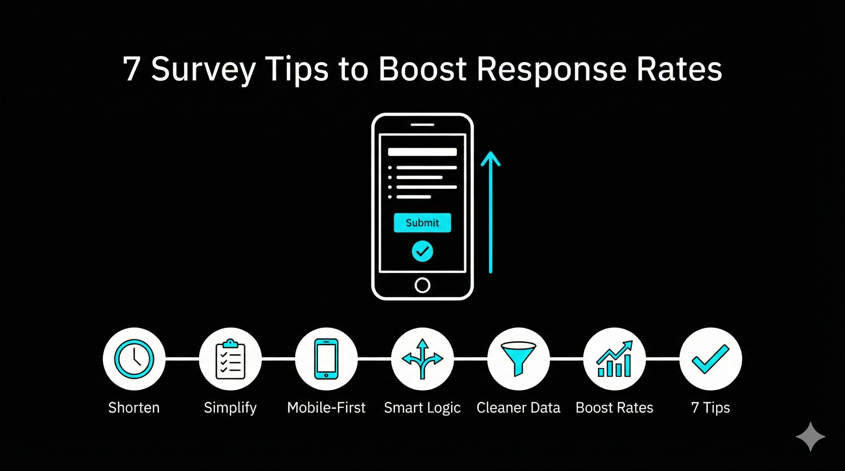
How to Design Surveys People Actually Finish
Is your survey getting ignored like an unread newsletter? You are not alone. Response rates drop when a survey feels long, vague, or irrelevant, and most fixes are boring but brutally effective.
This guide gives you seven practical survey design moves that consistently lift completion and improve data quality. Use them whether you are running a quick website poll or a full customer feedback program.
1. Cut the length until it hurts (then cut a little more)
People do not quit surveys because they dislike you. They quit because they ran out of patience.
- Keep it under 10 questions when possible
- Prefer one question per screen on mobile
- Remove anything that is “nice to know” instead of “need to know”
If you need more depth, run two shorter surveys rather than one monster.
2. Make the first 30 seconds feel easy
The opening determines whether someone commits.
- Start with a simple, non-threatening question
- Tell them the time cost in plain language: “2 to 3 minutes”
- Use a progress indicator if the survey is longer than a handful of questions
A small promise and a clear path beats a grand introduction.
3. Ask one thing at a time
Double-barrelled questions produce garbage answers.
Bad:
- “How satisfied are you with our product and support?”
Better:
- “How satisfied are you with the product?”
- “How satisfied are you with support?”
Also avoid hidden assumptions. Replace “How much do you love X?” with “How would you rate X?“
4. Write like a human, not a policy document
If a question reads like a legal clause, people skim it, misunderstand it, or bail.
- Use short sentences
- Avoid jargon unless your audience uses it daily
- Prefer concrete wording: “How often do you use feature X?” not “To what extent do you leverage feature X?”
If you are targeting marketers, talk like a marketer who has meetings in ten minutes.
5. Design for thumbs first
Most survey traffic is mobile. If your survey is fiddly on a phone, your bounce rate will punish you.
Checklist:
- Big tap targets (buttons, options, sliders)
- No wide tables or matrix questions if you can avoid them
- Short labels, clear spacing, readable font size
- Test on a real phone before you send
If your tool makes this difficult, switch tools. A survey that looks great only on desktop is a museum piece.
6. Make the questions feel relevant (personalization without creepiness)
Relevance is the fastest way to earn attention.
Easy wins:
- Mention the context: “About your recent signup” or “About the webinar you attended”
- Use conditional logic so people only see questions that apply to them
- Segment surveys by audience instead of forcing one version on everyone
If you want a straightforward way to do branching and segmentation without building a logic maze, build your survey in a tool that makes it easy. For example, you can create segmented surveys and routing rules in minutes in tools like https://tofusurveys.com, then reuse the same structure across campaigns.
7. Remind smartly, not aggressively
A polite reminder often brings in the responses you missed the first time.
- Send the first reminder 3 to 5 days after the invite
- Change the subject line and first sentence so it does not look like a duplicate
- Keep the reminder shorter than the original message
- Stop after 2 reminders unless the survey is mission critical
A good reminder reads like: “Quick nudge in case this got buried.”
Quick template you can steal
Use this as your invite copy:
Subject: Quick question (2 minutes)
Body: We are improving how we do X, and your input helps. This takes about 2 minutes, and your responses are confidential. Thanks in advance.
Link: [Survey link]
Common reasons people abandon surveys (and what to do)
- Too long: remove questions, split into two surveys
- Too generic: add context and routing logic
- Too hard on mobile: simplify layouts, avoid matrices
- Too many open-ended questions: keep one great text box, not five
- No payoff: tell respondents what will happen with their feedback
Final checklist before you hit send
- Can someone finish it in under 3 minutes?
- Is every question tied to a decision you will actually make?
- Does it look clean on a phone?
- Does the intro state the time cost and purpose?
- Did you test it yourself end-to-end?
If you do nothing else, shorten the survey and improve the first minute. Those two changes alone usually move the needle.
If you want a faster build process, especially for marketing use cases like website feedback and post-campaign surveys, start with a tool that keeps you honest on length and mobile UX. That is the quiet advantage of platforms like https://tofusurveys.com: you spend less time fighting the builder and more time asking better questions.